“Wie sieht dein Herz aus?” – Constanze Victoria Thieleke

Info

Catalogue “Wie sieht dein Herz aus?” (“How does your heart look like?”) by Constanze Victoria Thieleke. Published on the occasion of her first solo exhibition, held in the Waidspeicher Gallery, Kunstmuseen Erfurt, 2023.

Curated by Philipp Schreiner
Printed at Druckhaus Koethen
Published by @mmkoehnverlag
Typeface Magister by @omni.type
128 Pages, 22 x 28 cm, Hardcover

gta Edition & mono / gta verlag & intercomverlag

Info

Two hybrid paperback-series Nadine Wüthrich and me designed in a cooperation between gta-Verlag and @intercomverlag
and the developer Urs Hofer (Rokfor). Together we have worked on an infrastructure for hybrid publication formats that aims to think website (open access) and printed book together – technically and creatively. The volumes of the two series are published through Urs Hofers’ Rokfor Writer in printed form, as PDFs and in HTML. A generative layout process prioritizes text but also offer space for images, maps, and other appendices.

First entry in the new series gta-Edition by gta-Verlag: Vitruvius Without Text: The Biography of a Book by André Tavares. Open access-versions on gta-edition.ch

First entry in the new series mono by intercomverlag: Der Ingenieur – Grammatik eines Hoffnungsträgers by Robert Leucht. Open access-versions on intercom-mono.com

2022

Bauen und Bild: Der Wiederaufbau des Neuen Museums

Info

Johannes Bennke investigates in „Bauen und Bild / Building Images“, how images not only document the architectural and restorative handling of cultural memory, but also help to shape it. Therefore his book presents for the first time a photographic record of the reconstruction of the Neues Museum, Berlin, by David Chipperfield Architects @dca.berlin.

It‘s the first entry of <struct>, a new series at intercomverlag that aims to publish cultural analytical research about architecture. In the series, the aesthetic, referential and spatial elements of design should play a key role in conveying knowledge in the book medium and it‘s influence on the perceivable meaning is going to be addressed.

The book is also being published as entry into the series Berliner Schriften zur Museumsforschung, Institut für Museumsforschung, Staatliche Museen zu Berlin – Preußischer Kulturbesitz and Schriften des Internationalen Kollegs für Kulturtechnikforschung und Medienphilosophie, University of Weimar.

Published by intercomverlag
Printed by @dza.druck, Altenburg
Typeface: Lector, an digital reconstruction of Gert Wunderlichs‘ typeface from the 1960‘s @forgotten_shapes.

<struct> intercomverlag 2021

cache 01: Gegen|Wissen

Info

cache is publication series and tool for research groups. It enables them to work together on a topic, to arrange source material associatively and to layout generatively in various formats. The resulting series is a mixture of a collective essay and material collection.

Basic idea of ​​the design was to automate repetitive activities in the design process and to provide the researchers with an easy-to-use tool. Therefore the projects’ backend generates various HTML- and PDF-versions based on XML data. The script-based approach was consciously exhibited in the layout-design – and contrarily to the series name, not being hidden. Explanatory texts are printed in full column width.

Its first issue „Gegen|Wissen“ inquires the role of the sciences and knowledge in the protest movements of the 1970s and 1980s. 528 pages, 30 CHF, published by intercomverlag.ch

Realised in a cooperation between Chair for Wissenschaftsforschung, ETH Zurich and the Department for Visual Communication, ZHdK.
In collaboration with Loraine Olalia.
Mentoring: Prof. Sarah Owens
Assistance: Victoria Knabe
Coding: Janis Perren
cache Mono: @atelieramb
Gerstner-Programm: Forgotten Shapes 
Lyon: @commercialtype

Palms on Balconies – A visual study of contemporary houses…

Info

…from Romania built for representation

Since the revolution in 1989, Romania has seen a big wave of houses built for representative purposes, so-called palaces. These buildings challenge in many ways societal and administrative norms, and are built by a diverse range of people. Mostly commonly associated with these buildings are people of Roma origin, nevertheless a more widespread audience partakes in this building culture.

Seen from a social perspective, the work aims to broaden the previously limited research with a more differentiated approach. Through exchange with a substantial range of protagonists, and by working with visual ethnography, the project therefore seeks to produce typological images that inquire how social status is established through architecture.

Mentoring: Sarah Owens, Alex Hanimann, Jonas Voegeli
MA-thesis project in Visual Communication, Design, Zurich University of the Arts
Photography and writing in collaboration with Gabriel Amza
Typeface “Sono” by Simon Mager
#palaceresearch

Stiftung Buchkunst, Förderpreis für junge Buchgestaltung 2018, Shortlist

2018

Palms on Balconies – “Homing – Auf der Suche nach Zuhause”

Info

The exhibition “Homing” investigates the many notions, shapes and relations towards home in contemporary Romania in times of migration for work and economically challenging domestic developments. Gabriel Amza and me contributed with an excerpt from our project “Palms on Balconies”. It featured a series of photographs of houses built for the representative purposes of privates’ and photograms of building materials and objects we’ve found on construction sites.

Exhibited at Literaturhaus Stuttgart, 21.01.20 – 13.03.20. Curated by MISC Timișoara, House of the Arts Timișoara, Haus der Heimat des Landes Baden-Württemberg. Further exhibiting artists were Ema Staicut, Lavinia Braniște, Andrea Wolfer, Julia Lauter, Holger Fröhlich, Gabriel Amza, Philipp Meuser, Enver Hirsch, Jan Anderson, Juha Hansen.

2020

Romanian Palace Research: Typologic primer

Info

Investigation on the typology of representative mansions built in Romania. 50 houses in two towns were therefore taken into consideration with Google Street View. Next to Certeze, in north-romania, where mostly romanian construction workers come from and built their concrete dreams, the second one was Buzescu, a town mostly with a high population of Roma and well-known for their estate. By doing so, the project strives to question the exoticized perception of the often Roma-only ascribed phenomenon. Ongoing project, MA Visual Communication, ZHdK.
2017

Palms on Balconies – Photogrammetries

Info

Photograms of found objets on construction sites in Romania during fieldtrips for inquiring architectural expressions for social status.
Digitalized at HSLU Lucerne with Lukas Galantay
2018

Æther No°01 Publication & Website

Info

Hybrid platform for the simplified publication of essays written at the D-GESS Department of ETH Zurich. The project resulted in a website that publishes the monothematic issues in the form of articles on a website, downloadable pdfs and as a generatively layouted publication. Particular attention was paid to the tooling character, the design is based on a predefined system, the realization is managed by the backend. Further information: aether.ethz.ch.

In collaboration with: Loraine Olalia, Nadine Wüthrich
Mentoring ZHdK: Sarah Owens, Jonas Vögeli, Patrik Ferrarelli
D-GESS ETH: Nils Güttler, Max Stalder, Niki Rhyner
Coding: Daniel Stutz
Publisher: intercomverlag

2018

Lea Rudolph – Dauerausstellungen in Kunstgewerbemuseen

Info

Design of the thesis publication for Lea Rudolph at ZHdK. Typeface “Rima” by Simon Mager. 2017

A Collaborative Challenge

Info

A scenario on the relationship between the client Claire Vanderhulst, and you, the reader, slipping into the role of her designer.
Half autobiographic, half idealistic, it’s a summary of the yet learned lessons on collaborative working with clients.

Next to Kai Bernau’s Lyon, the publication is set in my custom alteration RS Claire Medium.
In showcasing formality but also personal character, RS Claire attempts to pick up the role-based relationship of collaborations.

Mentoring Nicole Udry
ECAL, University of Art and Design Lausanne, CH

2012

Planstadt Eisenhüttenstadt – “Ich habe mich nie eingeengt gefühlt”

Info

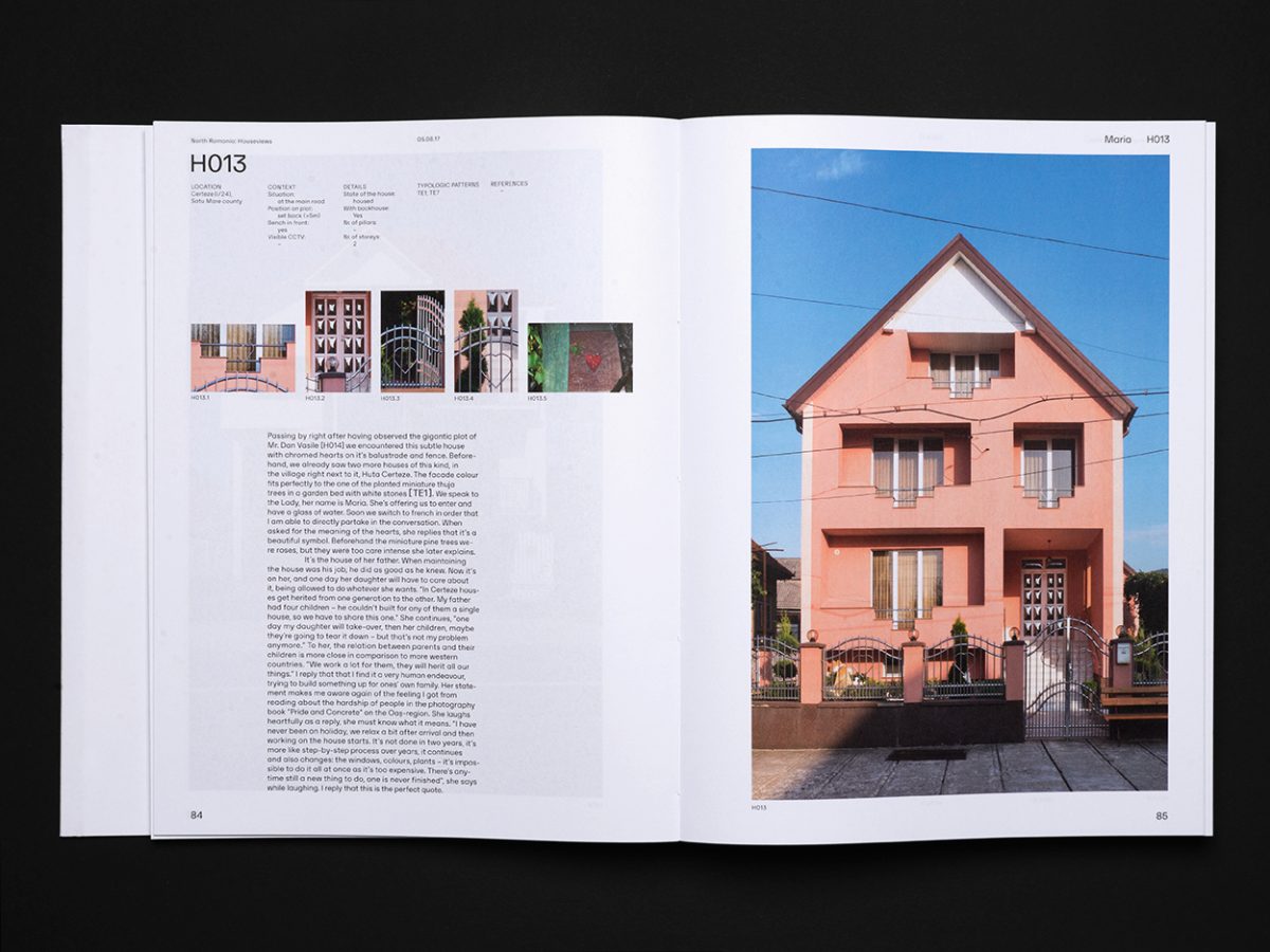
Eisenhuettenstadt is GDR’s first planned city, located in East-Germany near Frankfurt Oder.
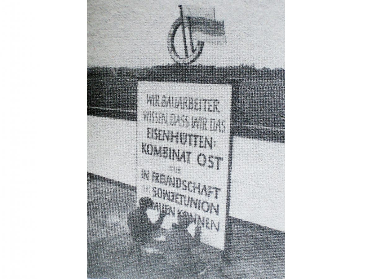
In the early 1950’s, this new city was built near an iron-hut to supply housing for up to 55.000 people.

While other planned cities were mostly build with readymade “Plattenbau”-segments, Eisenhüttenstadt’s city structure is more crafted and differentiated. It appears almost like a condensation in fixed-matter of the GDR’s vision for the life in idealism of the new socialistic man, as the GDR used to nurture it in the 50’s. The citizens often used to identify themselves with this, until the fall of the berlin wall in 1989. After crucial political and economical changes, Eisenhüttenstadt is nowadays confronted with completely other circumstances, way of lifes and ideologies.

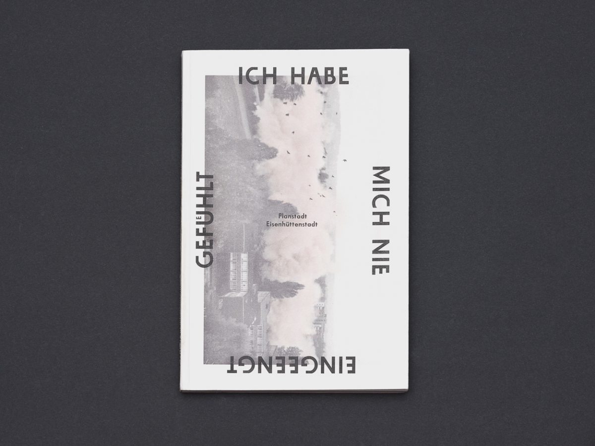
The publication and exhibition “Planstadt Eisenhüttenstadt” is meant as an possibility for an recognising and understandable approach to this field of tension. As authors we wanted to document the present status quo of Eisenhüttenstadt, cross the axes of the planned city, walk on it’s borders, and collect experiences of the citizens for an deeper, self reflected discourse on the relation of man and architecture on this particular place.

In collaboration with Tobias Keinath
Co-author Ben Kaden
Fotographic Assistance by Marija Heinecke
Mentoring by Markus Artur Fuchs &
Prof. Matthias Siegert

SUPER GROTESK HÜTTE – type family alteration in 3 weights, courtesy of FontFont Intl.

planstadt-eisenhuettenstadt.com
Slanted.de

2012